Compound
S . B0%

Compound

Naming · Brand Strategy · Brand Identity

Year
2026
Type
Healthcare · Men's Health Brand
Client
Compound by Eucalyptus
Role
Brand Strategy + Identity Design
Deliverables
Naming · Brand Strategy · Brand Identity
Compound cover

Compound is an integrated, personalised men's health program from Australian digital healthcare company Eucalyptus. Its difference is analytics: clinical-grade diagnostics like Dexa scans, VO2 max tests and detailed blood work, turned into credible insight and steady coaching.

We built the name on the idea that small, consistent actions compound, and drew a wordmark of old and new, gothic meeting digital. Imagery is inspired by the Dexa scan, moving from warm tones to electric glitch, so the brand can stand out when it needs to and stay calm when it is handling sensitive health information.
See case study
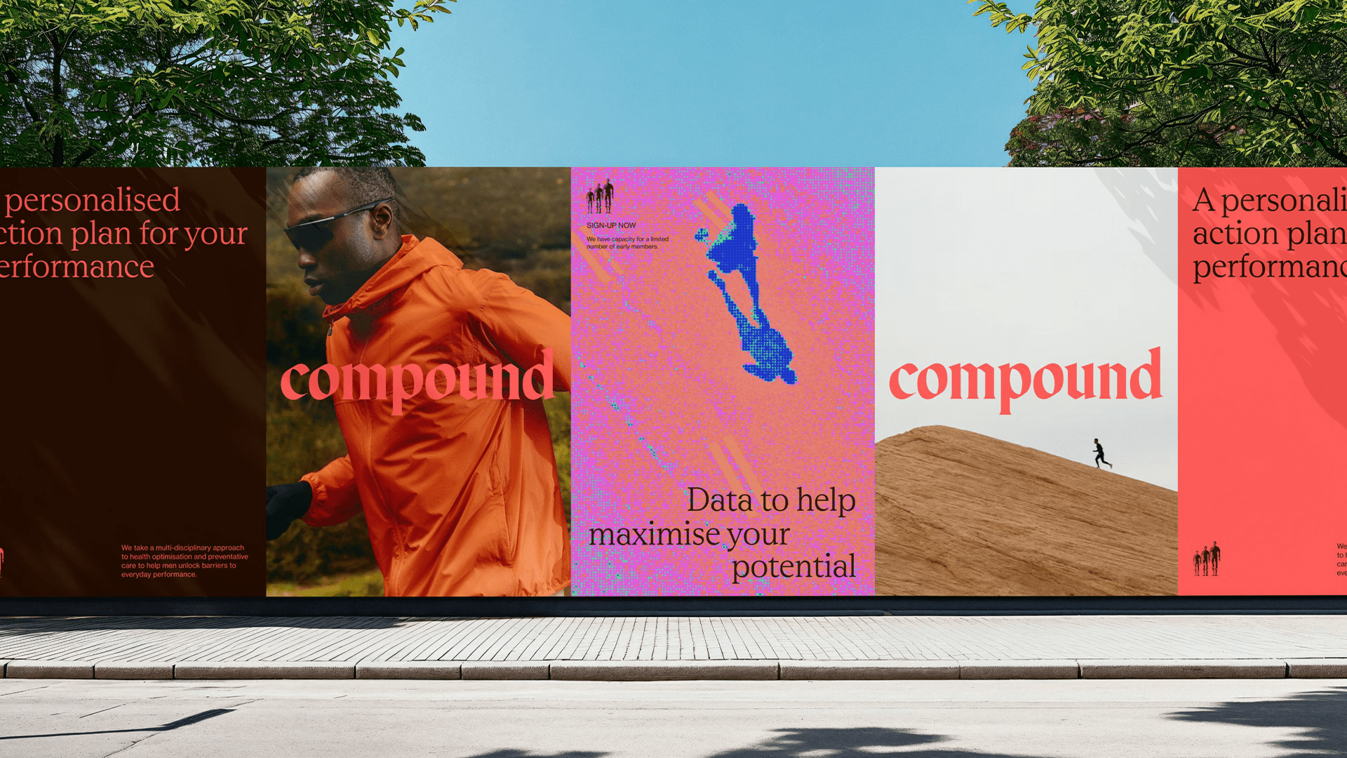
Compound posters along a street wall: coral, pink and blue panels with the serif compound wordmark
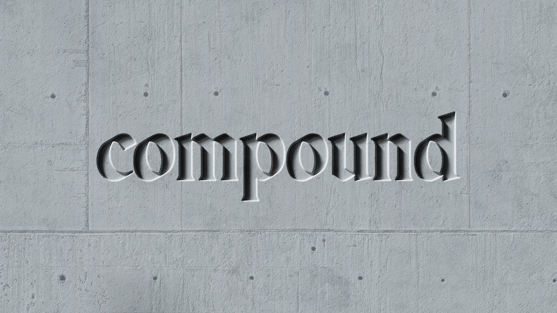
The compound wordmark debossed into a concrete wall
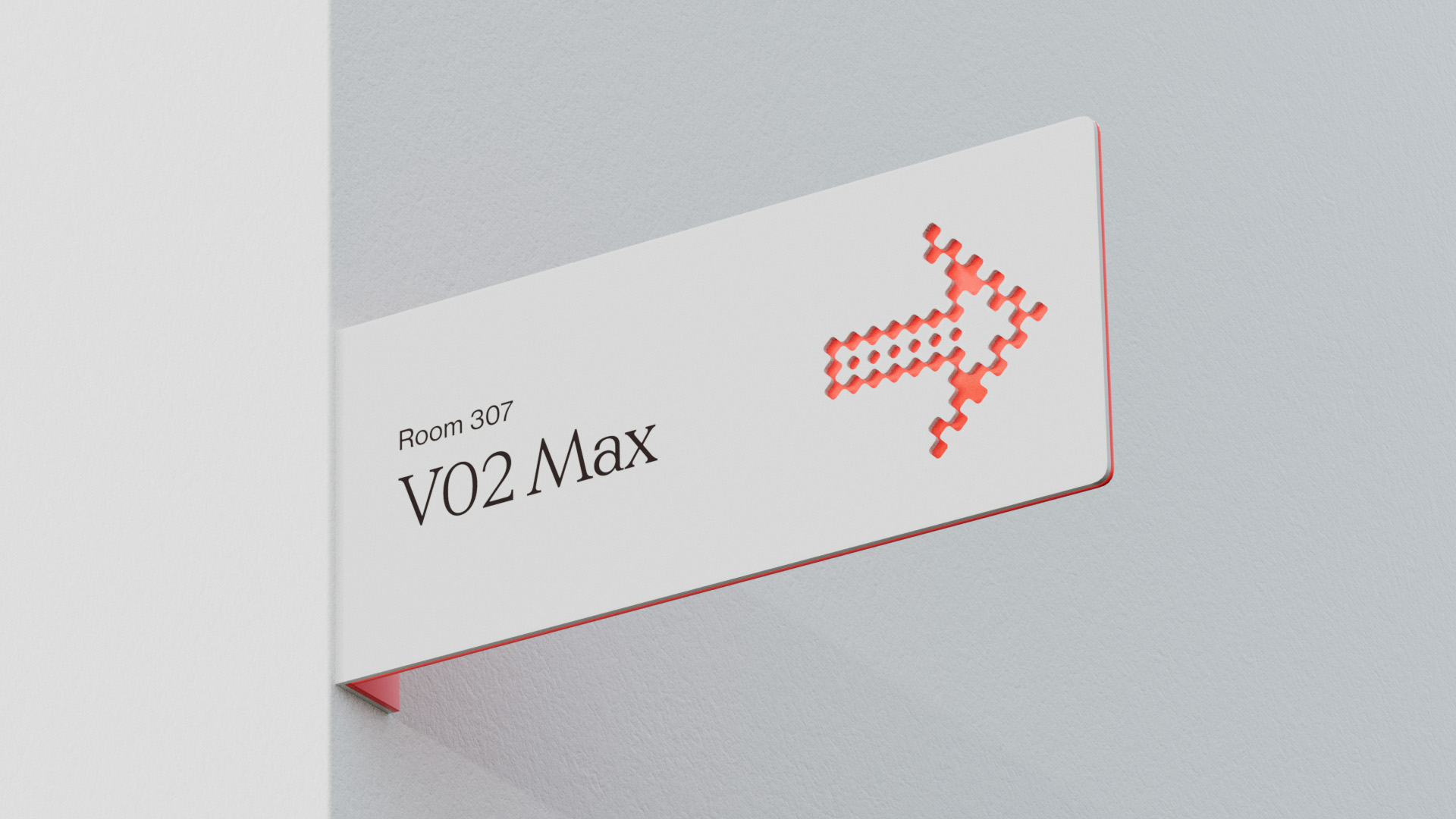
Clinic signage: a room sign reading V02 Max with a pixel arrow
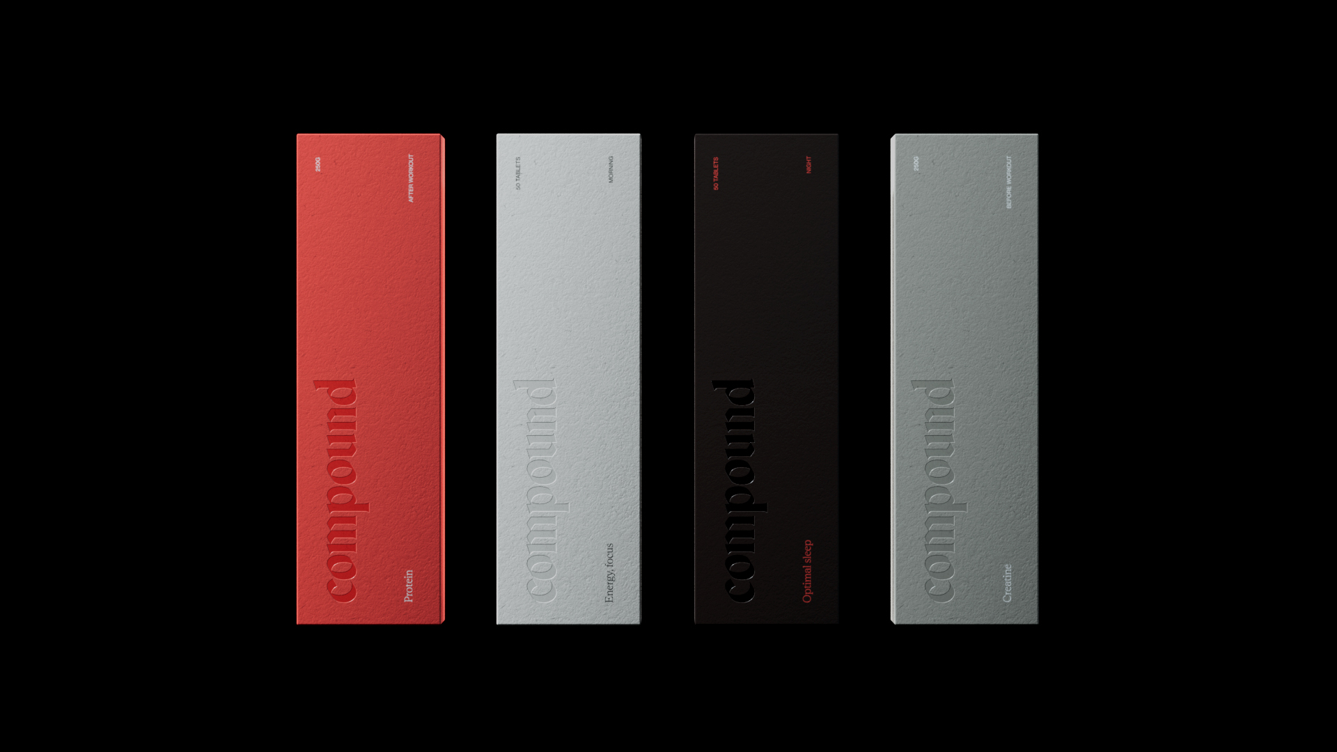
Supplement packs in coral, white, black and grey on a black background
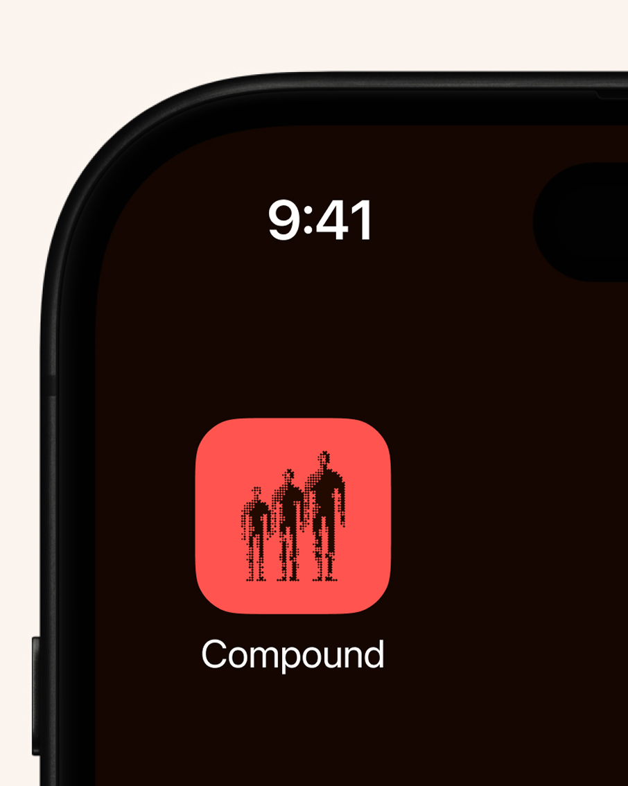
The Compound app icon on a phone home screen
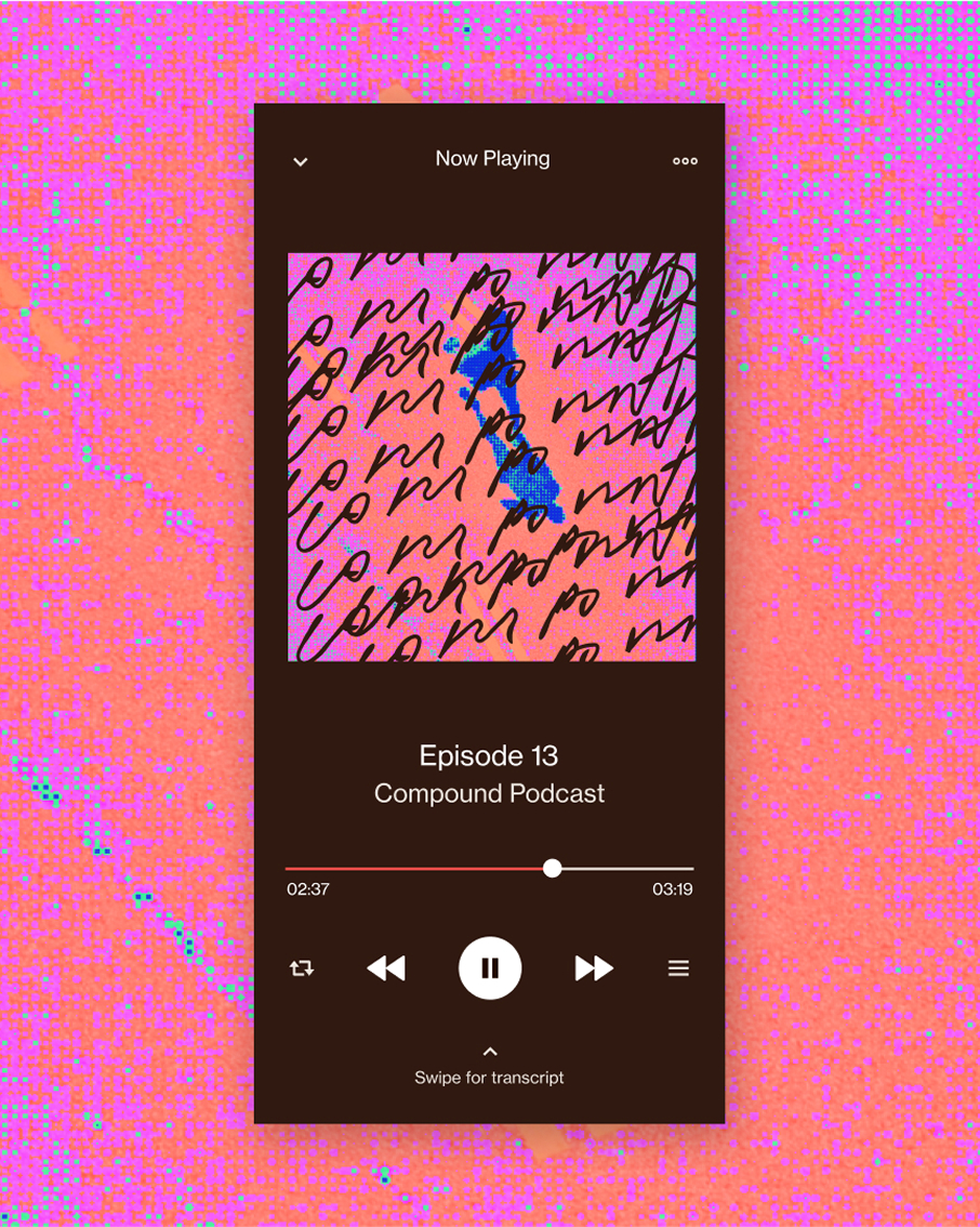
The Compound podcast player in pink and orange glitch imagery
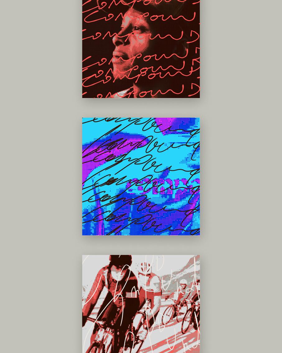
Compound podcast covers in red, blue and warm tones
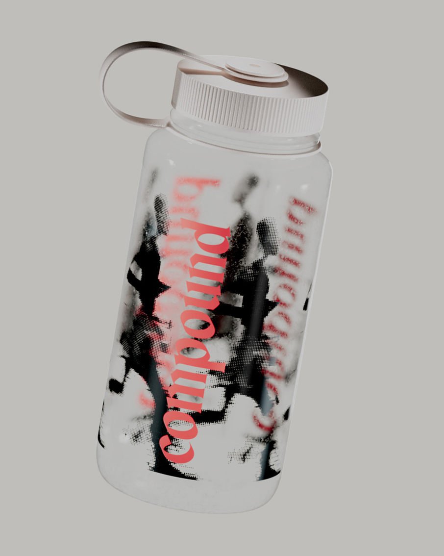
A water bottle with scrawled, signed versions of the compound wordmark
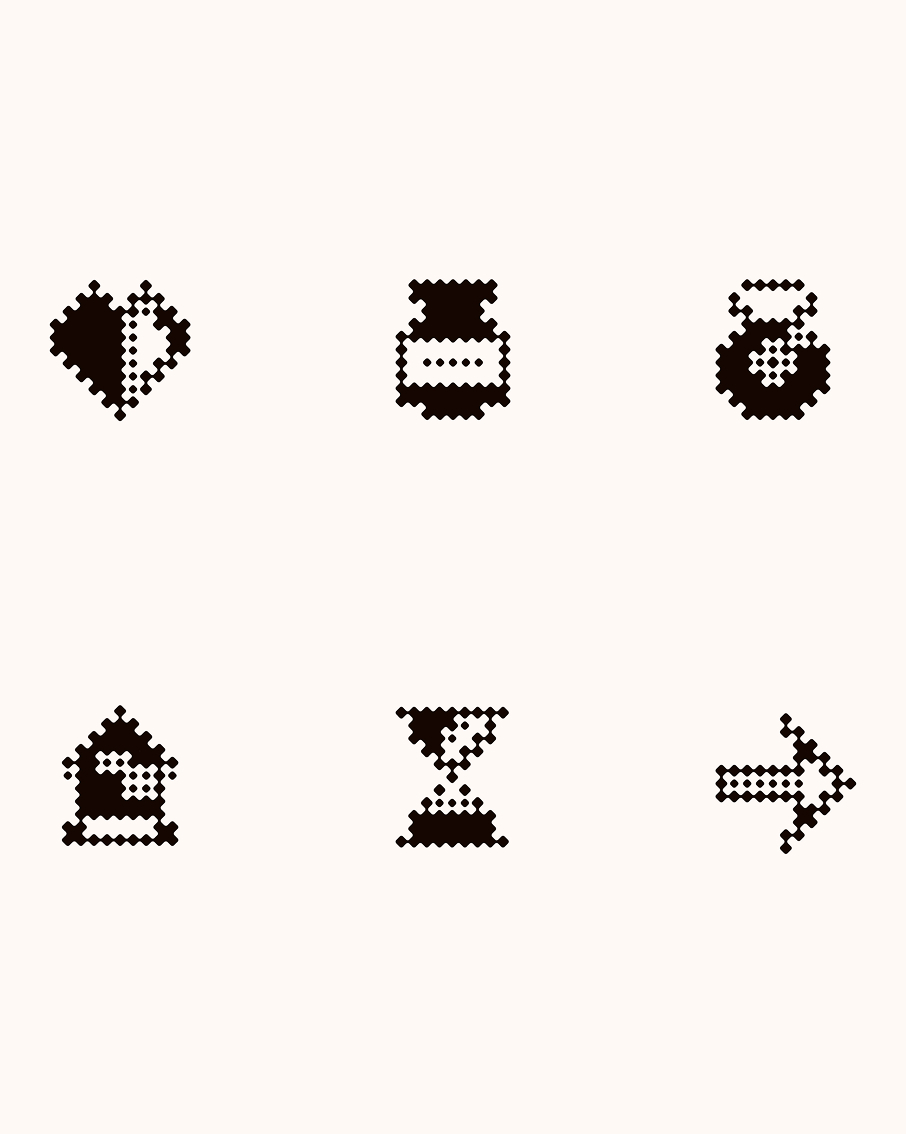
The Compound pixel icon set
Next projectJun